Data
Introduction
Data visualization looks at various types of data and graphs. The numeric data set is first formatted and then displayed through the code. Here, we visualize the data using maps and bar graphs based on the collected numeric data.
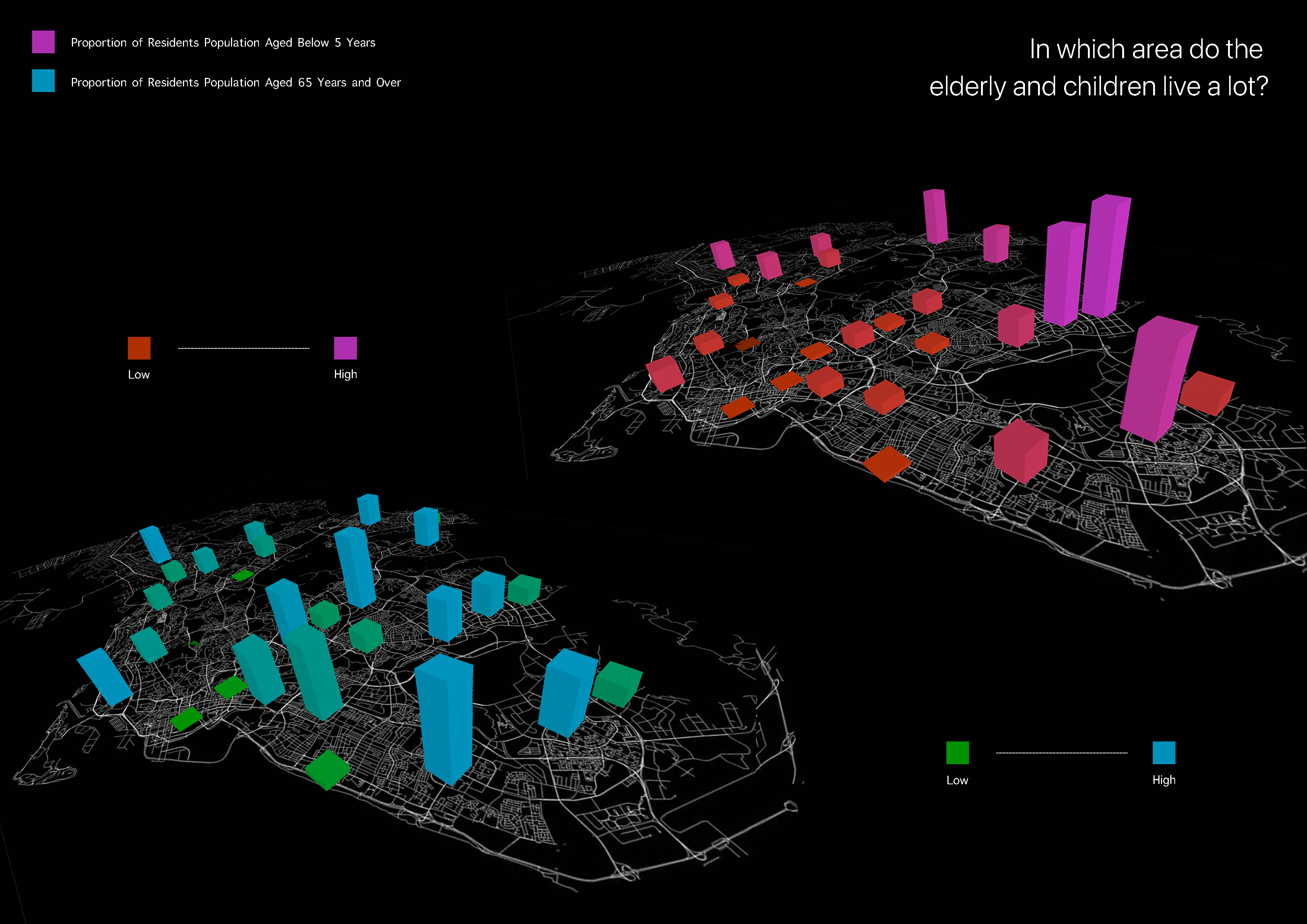
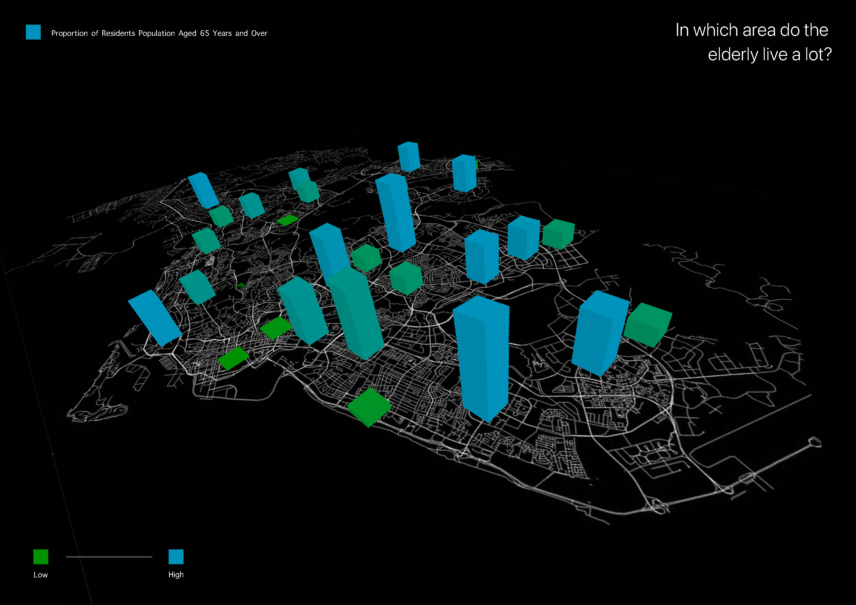
* Distribution of HDB residence by region over 65 years of age
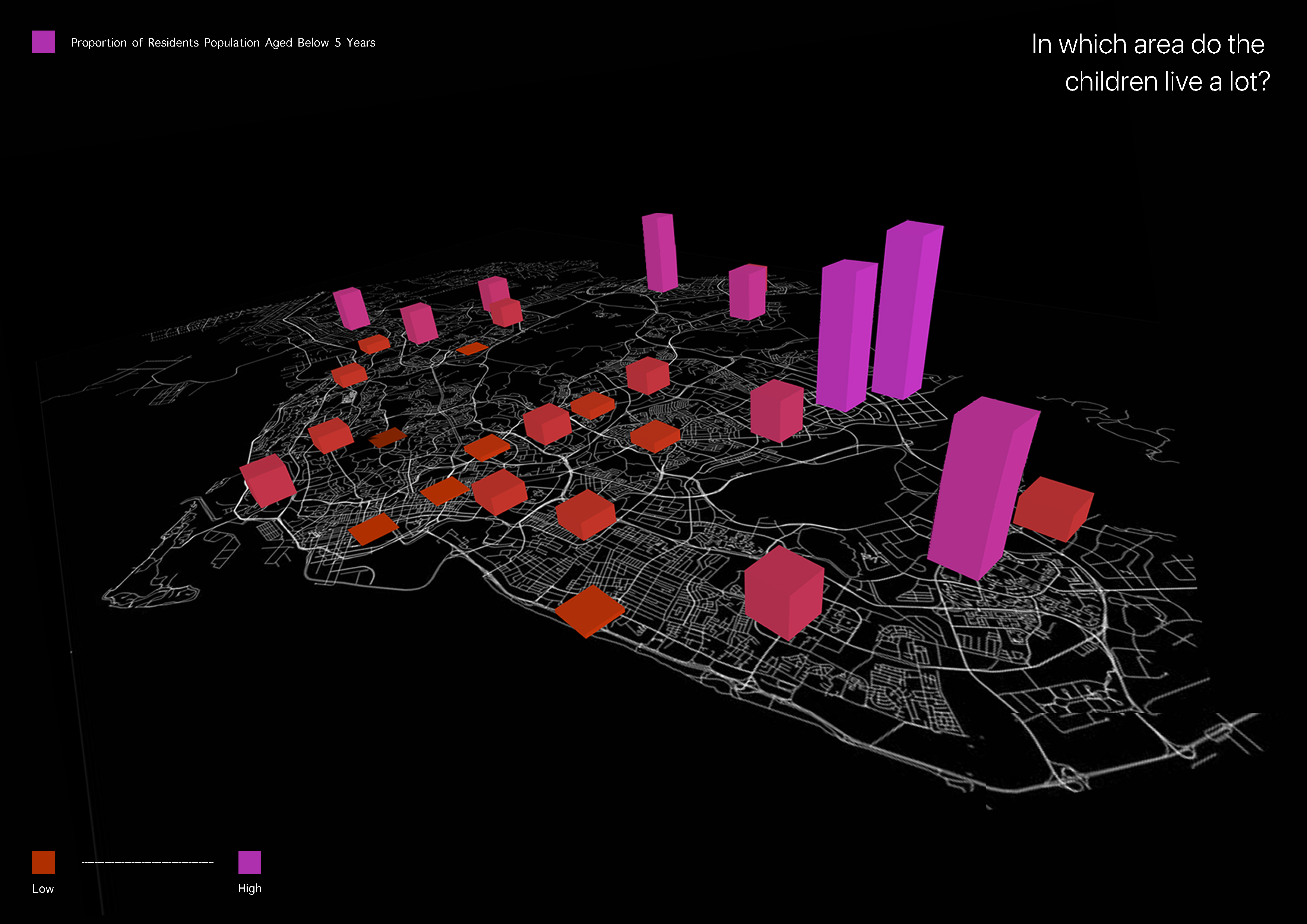
* Distribution of HDB residence by region under 5 years of age
A bar chart on a map is a combination of local maps and bar charts. It is useful when displaying geospatial data depending on the data. Locations can represent cities, countries, or other locations. Like the bar chart, the height of each bar is proportional to the value it represents. It is a suitable graph to effectively compare the number of HDB residents by region and age, the main data of this project. If you look closely at the graph above, the left graph shows the percentage of HDB residents aged 65 or older, and the right graph shows the percentage of HDB residents in children aged 5 or younger. It also shows more clearly by discrimination of color as well as height according to the value of the corresponding bar graph on the map.
A bar chart on a map is a combination of local maps and bar charts. It is useful when displaying geospatial data depending on the data. Locations can represent cities, countries, or other locations. Like the bar chart, the height of each bar is proportional to the value it represents. It is a suitable graph to effectively compare the number of HDB residents by region and age, the main data of this project. If you look closely at the graph above, the left graph shows the percentage of HDB residents aged 65 or older, and the right graph shows the percentage of HDB residents in children aged 5 or younger. It also shows more clearly by discrimination of color as well as height according to the value of the corresponding bar graph on the map.
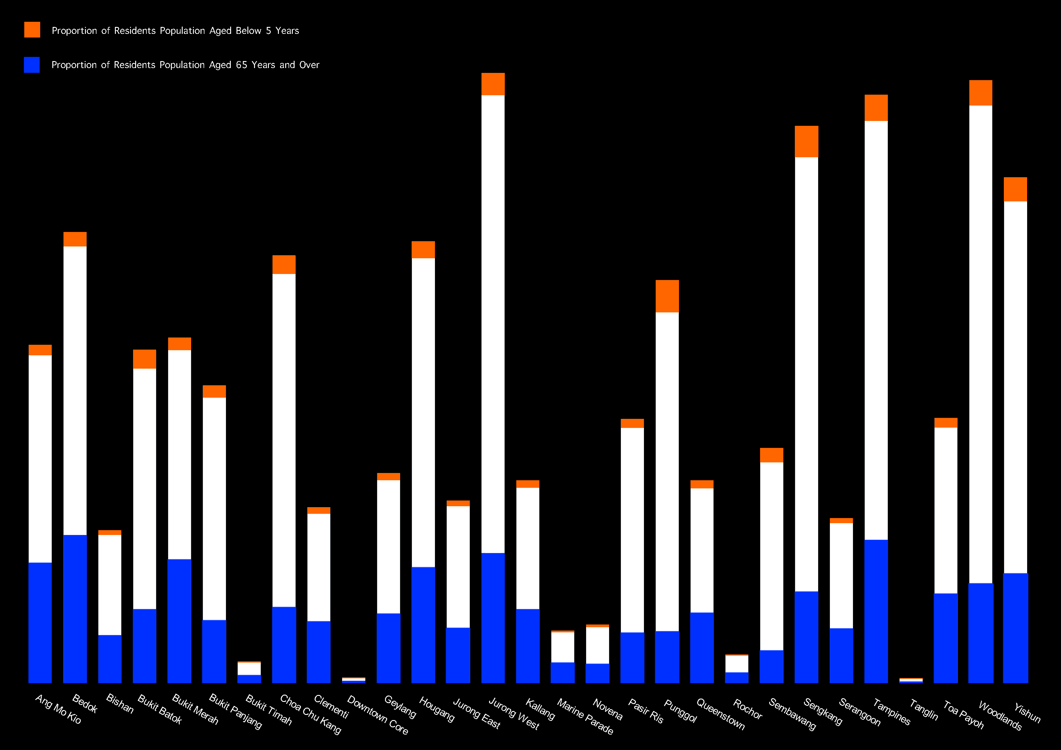
In 2021, Rochor, Ang Mo Kio, Bukit Merah, and Kallang are one of the planned areas where the proportion of residents aged 65 or older was higher than that of other planned areas. In each of these regions, more than one in five residents was found to be 65 years of age or older. In contrast, the proportion of children under the age of 5 was higher in the new planned area than in the elderly planned area, especially in Punggol, the proportion of children under the age of 5 was the highest at 8.3% among the residents in the planned area in 2021.
Overall, the elderly population aged 65 or older was mainly concentrated in the central part of Singapore, and the population of children under the age of 5 was concentrated in the outskirts. Among them, it can be seen that there is a high proportion in the North West, North East, and East regions. Furthermore, the population of young children is significantly lower than that of the elderly.
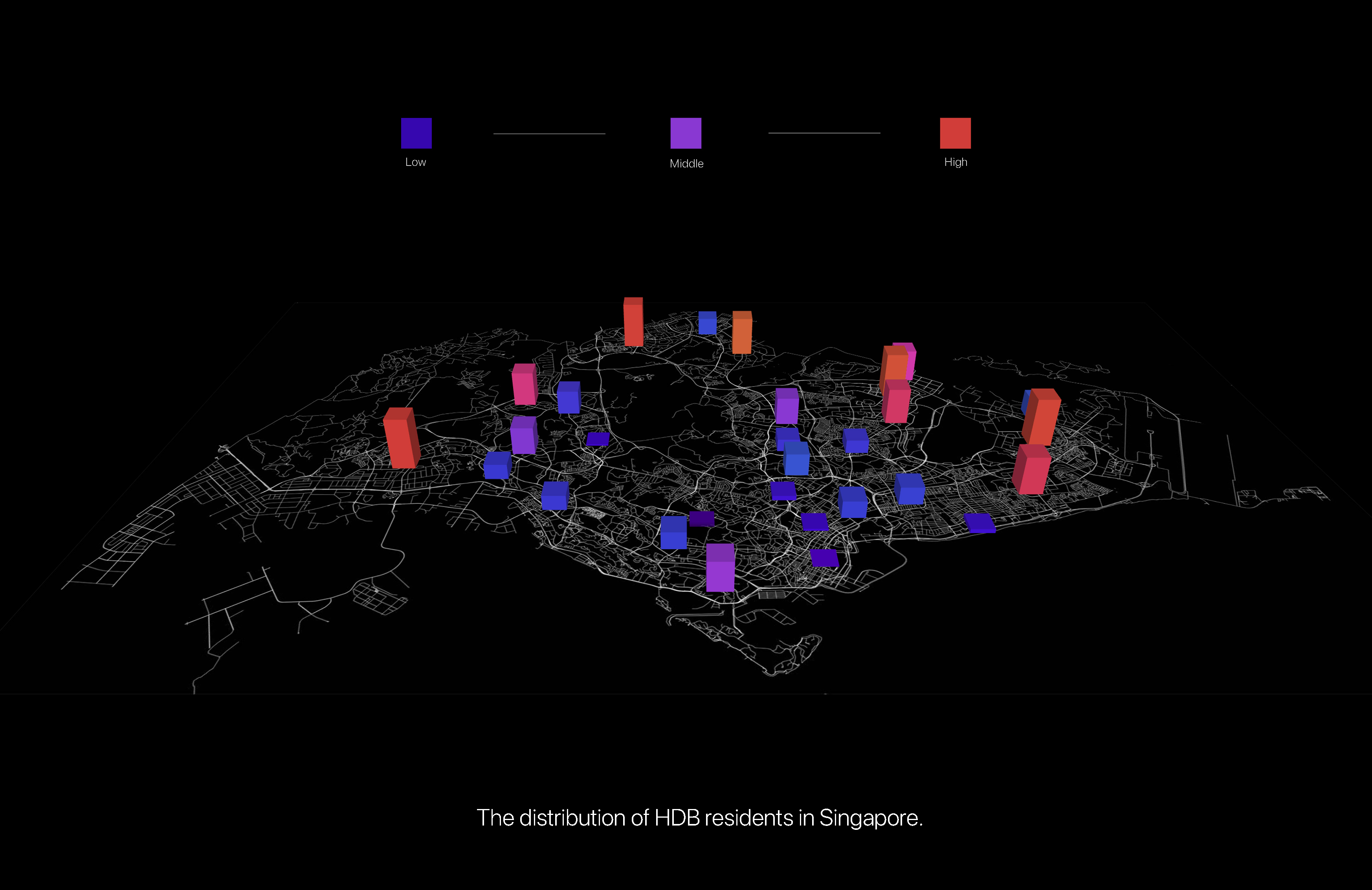
Through this data visualization, I was able to understand Singapore's geography in detail. In addition, you can see the distribution of HDB by region and where the elderly and children live, respectively. Furthermore, considering that the proportion of the elderly population is significantly higher than that of young children, it was possible to derive a social problem that Singapore is rapidly aging. In addition, it can be seen that the population distribution of the elderly and children by region is also related to Singapore's urban planning history.
This can be related to Singapore's urban planning. In the past, Singapore planned urban development from the central region to the outer region in order. For this reason, in the past, many people lived in the central area, and many people have not left the center for a long time and have lived until now. This is why more elderly people live in the central area than in the outer area. Gradually, as urban planning progressed to the outskirts, people gradually spread to the outskirts. Currently, the new generation has come to prefer areas where urban development has been carried out relatively recently rather than the center, which has been a long time since urban development has been carried out. In particular, people with young children are raising children in the outskirts of a cleaner environment and better air. This is why the proportion of young children is high in the outskirts. In addition, considering that the population of the elderly is larger than that of children as a whole, it can be seen that aging is underway in Singapore.
Data Visualisation
1. Bar graph on a Map
2.Stacked Bar Graph
Findings
Insights
Conclusion
References